
Case Study: How to Run an Effective Remote UX Workshop
Challenging times offer opportunities to build consensus for change and progress. This is certainly true of the pandemic that we are currently facing. At Salsita, our staff is currently working from home. Rather than treating this as a barrier to progress, we decided to embrace the experience...
Table of Contents
You never want a serious crisis to go to waste. - Rahm Emanuel, Chief of Staff to President Barack Obama
Challenging times offer opportunities to build consensus for change and progress. This is certainly true of the pandemic that we are currently facing. At Salsita, all of our staff are currently working from home. Rather than treating this as a barrier to progress, we decided to embrace the experience to hone our skills at running remote UX workshops.
We work with clients all across Europe and North America. As a result, we frequently run workshops with some remote participants. But what about a workshop where everyone is remote? Is it possible to collaborate efficiently to achieve high-quality results? To find out, we decided to run a fully remote internal UX workshop focused on designing a slick 3D product configurator demo for our website.
The plan was to do a week-long Design Sprint. This methodology, invented at Google, packs an entire design/develop/test cycle into a single week. Once the initial design is ready, a day is spent prototyping the solution and another day is devoted to user testing. Any new ideas surfaced by the user testing can then be incorporated into the prototype. By including user feedback early in the process, this approach helps identify UX issues before developers have spent weeks or even months implementing a potentially faulty design.
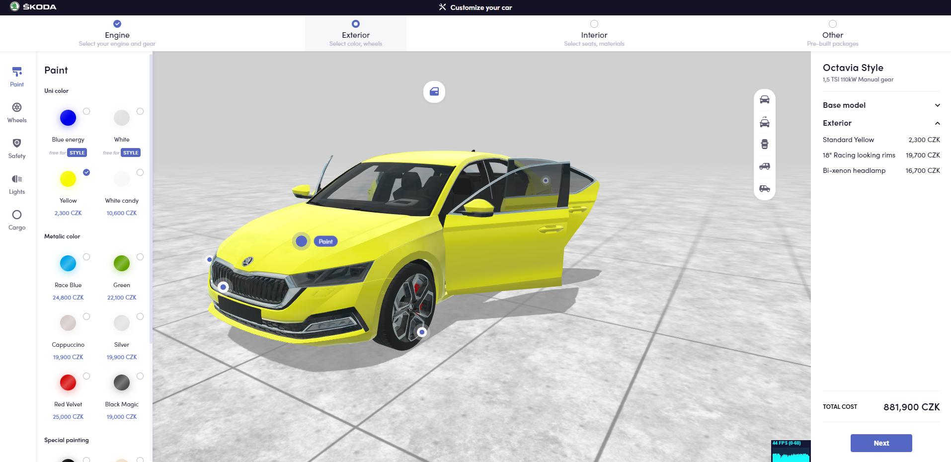
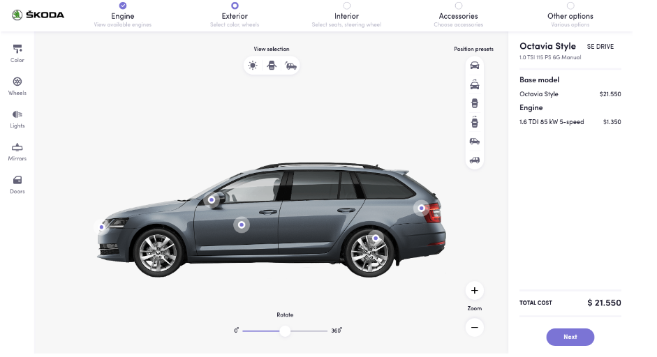
View demo prototype: https://car.configurator.salsita.co/
PREPARATION
We convened—virtually—on Wednesday morning to kick off the first session. As always, we had assembled a multidisciplinary team: Jan Mikula (Director of Product), who ran the workshop, Katerina Kelepouri (UX designer), Jan Bartunek (UI developer), Jiri Stanisevsky (full-stack developer), Griffin Trent (product manager). As this was a strategic initiative, I also sat in on most of the sessions.
The first question: what to design? We knew we wanted a product configurator, but that hardly narrows down the options. The ideal choice would be complex enough to be interesting, simple enough to be manageable in a week-long workshop, and representative of the kind of solutions that we are building for clients. We knew future clients were unlikely to be looking for a configurator for a paperclip or military fighter jet (but if you are, give us a call!).
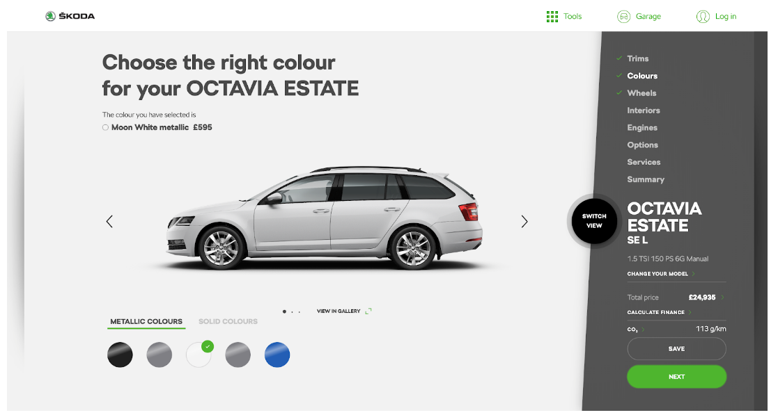
We settled on a configurator for the Skoda Octavia, a popular Czech-made car. The configurator on Skoda's site has some UX issues, and we were intrigued by the challenge of coming up with something better.
Before the official sprint kickoff, each participant was tasked with finding existing apps to provide inspiration. These are usually apps that we admire and want to emulate, but can also be apps that illustrate pitfalls to be avoided. Sometimes even apps that are far from our target domain can be a source of great ideas.
Jan, our facilitator, also sent out a detailed schedule for the first two days of the workshop before we got started. This ensured that everyone had blocked time in their schedule to participate. Long meetings can be exhausting even in person. When the meeting is remote, it can be even harder to focus with email, WhatsApp and an infinite supply of unfunny dad jokes only a click away. So we divided the sessions into 45 minute calls with 15 minute breaks to let people recharge their batteries. Jan used the breaks to synthesize and reformat the output of the previous session, where necessary, to make the next session as efficient as possible.
TECHNICAL INFRASTRUCTURE
When doing an in-person Design Sprint, the infrastructure can be as simple as a whiteboard, some post-it notes and a few pens. Obviously that doesn't work as well when everyone is working remotely (and may not even be wearing pants). We choose a number of online tools to help us run an effective workshop, some of which we had used extensively in the past and some of which were new to us:
- Slack is our primary communication channel even when we're in the office. After all, what self-respecting developer wouldn't rather stare at their screen with music blaring in their headphones while texting their colleague in the next room, rather than risk a proper face-to-face interaction? We regularly use Google Hangout Meets for video conferencing, but for our remote workshop we decided to do a Slack video call instead. The main reason was that Slack has a cool feature that lets you draw temporary annotations during screensharing (for example circling something to draw attention to it). We also set up a Slack channel for the workshop and used it for coordination and sharing links to other tools. This permanent record has proven invaluable as we've gone back to refresh our memories about the flow and content of the workshop.
- We use InVision for sharing design mocks and we experimented with using their Freehand app as a shared whiteboard. It isn't bad but in the end we decided that Miro has a better mix of features and usability.
- When participants needed to make sketches, we let them do so in the tool of their choice and pasted the results into Miro afterwards. The more artistic among us opted for a tablet and electric pencil, or even good old-fashioned pen and paper (to be scanned later). Some of us can't draw a straight line to save our life and chose a drag-and-drop design tool like Keynote instead.
- Everyone used their preferred tool for taking notes. We shared the notes in a Google Doc and set up a folder on Google Drive for all our shared documents.
THE DESIGN SPRINT
Day 1: Identifying the Challenge
The goal of the first day is to ensure that the team understands the problem and challenges, and to map the entire user journey from start to finish.
Expert interviews, lightning demos and "how might we?" questions
In order to frame the challenge, experts are invited to share their knowledge with the team. In the case of a client project, these experts are often client stakeholders such as the product owner, marketing staff or company management. They can also be third-party domain experts.
While the expert talks, everyone else jots down so-called "how might we?"—or HMW—questions. These capture important issues that need to be addressed as part of the product design. For example, if the expert complains that existing solutions don't let you see the 3D model until you're done choosing all the options, someone might jot down "HMW let the user see what their chosen options look like in real time?".
In the case of our workshop, we didn't have a client so we invited experts from our team. These consisted mainly of staff from product design, engineering, marketing and management who have been involved in configurator projects in the past. Normally each expert would be interviewed for 15 minutes or so to capture their perspective on the task at hand. In this case, we weren't really experts on configurators, so we decided to skip the interviews and combine this phase with the lightning demos that normally come later in the day. We took turns showing off examples of web-based configurators that we had found during the preparation phase while the others jotted down their HMW questions.
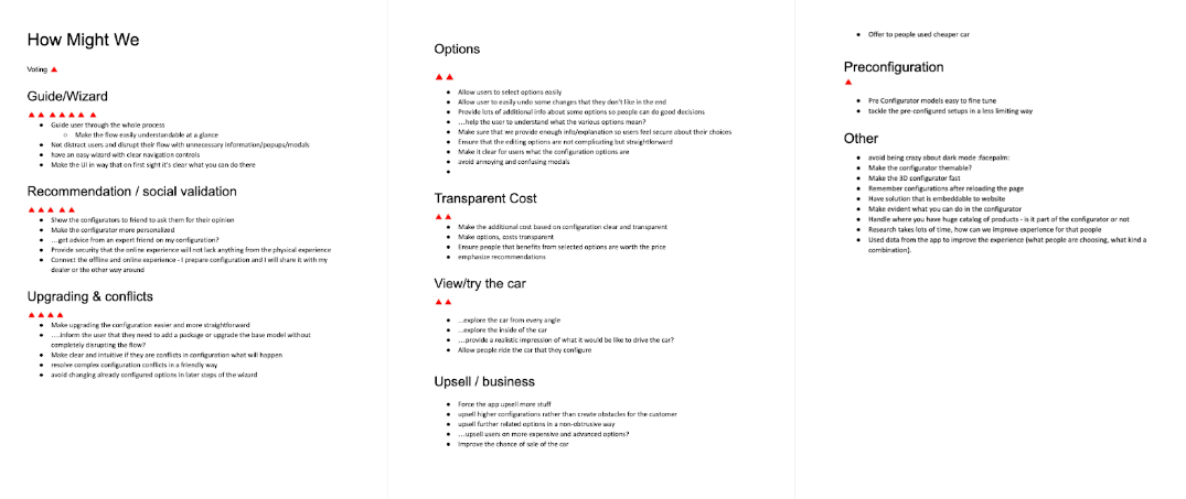
During the break, Jan gathered everyone's HMW questions, organized them into a few high-level categories and pasted them into a handy Google Doc. When we reconvened, everyone was given three virtual votes represented by red triangles. We went into the doc and pasted our votes next to the categories we considered most important. This helped identify which areas we should focus on over the next phases of the workshop.
User journey mapping
The team then mapped out the "user journey", i.e., the expected path of the user through the configurator. We used InVision Freehand to sketch it in flowchart form:
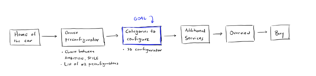
The user journey is typically quite high-level. It is helpful nonetheless in keeping everyone focused on the goal at hand, rather than wandering off on irrelevant (although doubtless fascinating) tangents.
Synthesizing the lightning demos
According to Thomas Edison, genius is one percent inspiration and ninety-nine percent perspiration. But all that sweat and hard work won't amount to anything without the right spark to light the creative fire. This is the purpose of the lightning demos: to show off examples that help identify features to emulate in our own project. Sometimes someone might decide to do the opposite and show a demo of a really bad implementation illustrating what we should aim to avoid. The demos should be short and sweet, ideally just a few minutes long.
In our case, we had decided to combine the lightning demos with the expert interview phase. So we started with the existing notes we had taken during the demos and listed what we considered to be the most important insights.
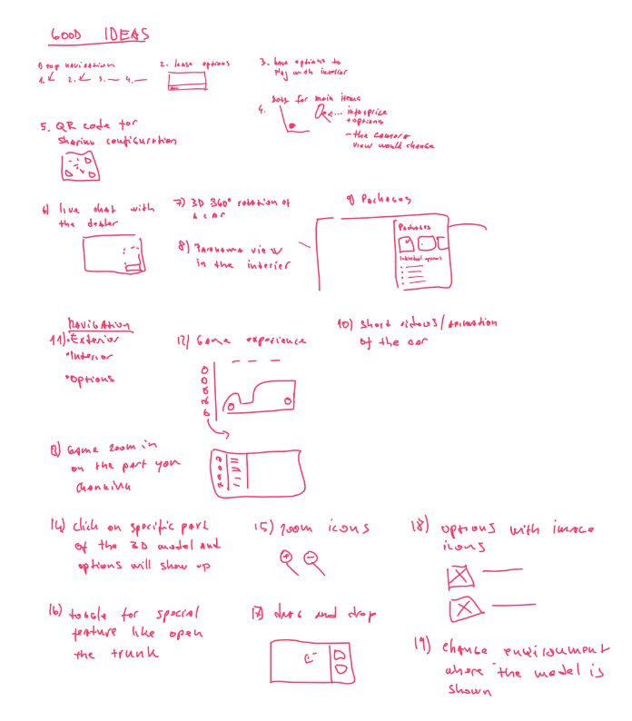
Sketching
The second half of the day was devoted entirely to sketching what each of us felt the user interface of our planned configurator should look like. The Design Sprint philosophy tries to avoid brainstorming, which tends to favor the loudest members of the group. It can also lead to groupthink. Instead, each participant worked independently to create their sketches using the tool of their choice.
In a classic Design Sprint, preparation, expert interviews and lightning demos take up the whole first day, so sketching takes place on day 2. In our case, we used the time we had saved by combining expert interviews and lightning demos to get the sketching done in a highly intense and focused afternoon session.
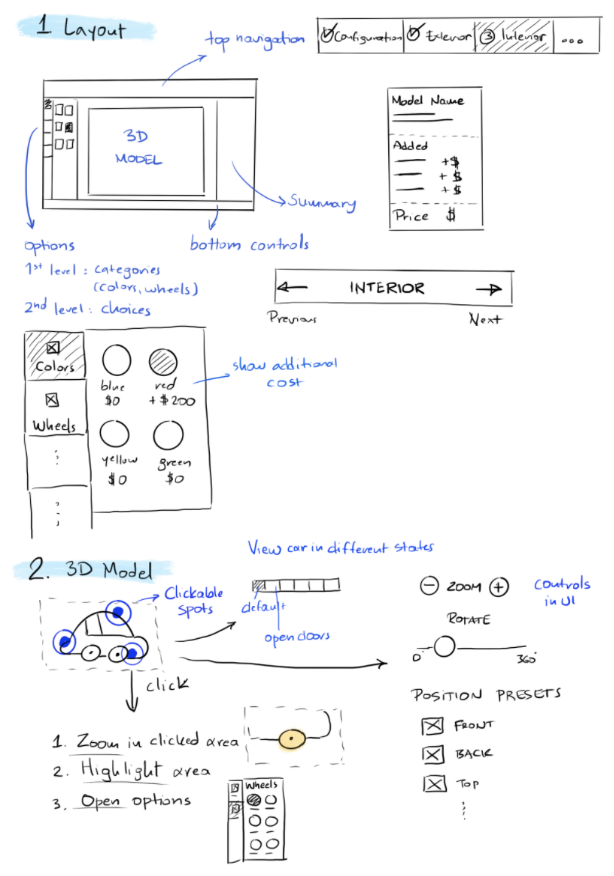
The artistically inclined among us took a pencil and paper (or a tablet and electronic pen) and literally sketched the important screens. Those of us who can't draw a straight line freehand opted for a drag-and-drop tool like Keynote.
Day 2: Design-Making and Storyboarding
By the end of day 1 we had generated a lot of ideas—too many to tackle in the limited time available. The goal of day 2 is to choose the best concept and flesh it out in preparation for the prototype development later in the week.
Concept presentation
Before we got started with the first session, Jan had gathered together the various sketches and pasted them into an Invision Freehand board. Each team member then presented their sketch, highlighting what they considered to be the more important aspects.
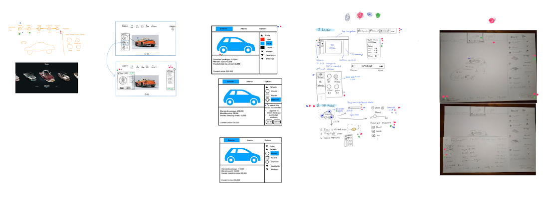
After the presentations, everyone got a few virtual votes in the form of colored dots. We went through the board placing dots next to ideas we liked most. If we liked the entire concept, we placed a big dot next to it. Unsurprisingly, our UX designer Katerina blew away the "competition" with her beautifully hand-drawn and well thought-out sketch. But everyone got at least a vote or two for their specific ideas.
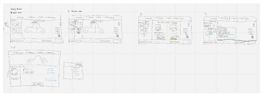
Storyboarding
We then put all the pieces together, creating a unified script for the prototype based on the concepts and ideas that had garnered the most votes.
We used the script as the basis for a storyboard consisting of the sketches of all the most important screens in the planned prototype.
Sidebar: Practical Lessons Learned
In many ways, running a fully remote UX workshop is very much the same as a traditional in-person workshop. We did note some specific considerations and challenges that should be kept in mind.
Show people the tools and have them try them out before the workshop
Everyone knows how to grab a marker and scrawl on a physical whiteboard. It is less likely that they have experience with a web-based shared whiteboard, as well as some of the other tools required for a remote UX workshop. Making sure they are familiar with the tools beforehand will save you valuable time that would be better spent on discussing, sketching and prototyping.
Choose your facilitator wisely
A strong facilitator is important for any UX workshop but is particularly crucial for a remote workshop. Coordination is more challenging when all participants are remote. The facilitator is in charge of planning which is essential for a successful workshop. They must also make sure that everyone's ideas are heard and fully explored on the video calls.
Proper tools can make remote collaboration more effective than a face-to-face workshop
Doing an in-person workshop has its own challenges. For example, a physical whiteboard cannot be easily recorded, has limited space and has to be erased regularly. The problems are compounded when, like us, you run workshops that have some in-person and some remote participants. The latter can't write on the whiteboard and sometimes can't even see it properly. Use of online tools makes collaboration and recording of the session considerably more straightforward.
Record everything
One of the biggest advantages of a remote workshop is that everything can be recorded: the whiteboard, shared documents, the video call itself and the user testing sessions. This persistent record can prove invaluable when you move to the implementation phase. Make sure you record everything to take full advantage of the discussions and deliverables produced by the workshop.
Day 3: Prototyping
Rapid prototyping can be done using any number of tools and approaches. It could be as simple as a set of PowerPoint or Keynotes slides. Or the team could bash out a full-fledged web app in running code using HTML, CSS and JavaScript (but be prepared to type really fast or put in some serious overtime).
Whichever approach you take, the key requirement is that it be detailed and interactive enough to be used for user testing. You're not just creating pretty pictures. People need to be able to use the prototype in some meaningful way and give useful feedback.
In our case, we decided to let most of us take a break from the workshop to tackle our growing email backlogs and other work that had built up over the previous two days. Katerina meanwhile went to work implementing a clickable prototype in Adobe XD based on the storyboard that we had put together.
Day 4: User Testing
Every experienced UX practitioner knows that no amount of expertise, hard work and creativity can ensure that a given product design will work in practice. You never really know how users will react to your design until you put it in front of them and test it. This is why a full day of user testing is baked into the Design Sprint methodology.
It can be incredibly eye-opening to watch testers struggle with features that you assumed would be obvious. You put a big orange button right in the middle of the screen, blinking and rotating in 3D. Then you squirm while testers search every corner of the screen for the right thing to press, while you silently scream at them "The big orange button! For crying out loud, click the big orange button!"
At Salsita we typically run user testing sessions with volunteers from our staff who aren't involved in the project. If we need to recruit outside testers, there are platforms like Userlytics that make this quick and easy for a moderate price.
In this case, we asked four employees from our engineering, marketing, design and admin departments to try out the configurator prototype. It is well established that you get most of the useful feedback you're likely to get on a given design from just a handful of testers, with rapidly diminishing returns after that. We also produced two subtly different versions of the design so we could get feedback on which one our testers preferred.
The most obvious takeaway from the tester feedback was that they universally liked the overall approach and found the design to be attractive, powerful and understandable. There were numerous specific recommendations for small changes. As always some of the most useful conclusions came not from what the testers said explicitly, but rather what they didn't say. Every tester overlooked some capabilities of the configurator, giving us great insights into features that we needed to make more prominent (or get rid of completely).
Three out of four testers preferred the second variation of the prototype, a clear indication that this was the approach to pursue in a future implementation.
In a way the user testing was actually easier due to the fact that it was performed 100% remotely. If the tester is sitting in the same room as you, you need to figure out a way to record both the application and the tester, whose facial expression often speaks volumes. When you're on a video call anyway, it's a snap to press record while the tester is sharing their screen. We used Slack calls for most of the workshop but switched to Google Meets for the testing since it has a built-in record feature that saves both the screen sharing and the video thumbnail of the active participant.
Day 5: Tweaking and Polishing
Having compressed the first two days of the Design Sprint into one, we had the luxury of an extra day to play with after the user testing. We did a two-hour supplementary UX session to discuss the feedback, then asked Katerina to adapt the second variant of the prototype to take the comments and observations into account.
IMPLEMENTATION
The output of the workshop was a polished clickable prototype, a ton of notes and sketches, and a great working understanding of how a 3D product configurator should look and behave. In other words, we had everything we needed to kick off the implementation phase of the project in style.
We decided to use Basecamp's Shape Up methodology to whip up a first version of the configurator in six weeks with a multidisciplinary team of two full-stack developers, a user-interface developer, a QA engineer and a product manager. The project is well underway and the benefits of a deep and thorough UX phase have been apparent throughout. But that's a subject for another day.


